24 May 2012

TITANIC LETTERPRESS VIDEO

Thanks to Rich Gilligan for shooting the footage and to Alex Bradley for the edit. Click here to see the promo video for the book on Vimeo.


15 May 2012

WEBSITE FOR THE BOOK

The book now has it's own new website where you will find details, photography and video. Kindly built by Mary Plunkett.


www.albertandernest.com

4 May 2012

Colm Tóibín visits Distiller's Press

Colm Tóibín dropped by yesterday for over an hour and a half to see the book as it nears the end of production. Since coming on board to write the foreword he has been in contact many times and has been great to work with. After a quick tour of the press we spent a long while analysing each and every illustration up close. Colm has meticulously signed all copies of his foreword with his own beautiful fountain pen. We're delighted with this development and we must thank Colm for his generous support of this project from the outset.


11 Apr 2012

'ALBERT, ERNEST & THE TITANIC' (pre-launch sale)

This day 100 years ago Titanic steamed into Queenstown, Co. Cork. This was to be the last time she would weigh anchor before heading across the Atlantic towards New York. To celebrate this event I'm now offering ten copies of my book for sale at a discounted rate.


Albert, Ernest & the Titanic tells the story of the Titanic’s ill-fated on board printers, Abraham ‘Albert’ Mishellany and Ernest Corbin as they travel on the ship’s doomed maiden voyage.

Irish author Colm Tóibín writes in his foreword for the book: “As we mark the centenary of the sinking of the Titanic, we are reminded of the amazing gallery of prose and poetry prompted by the events of 1912. However, as well as the passengers, we cannot forget the skilled craftsmen who worked on the ship.”

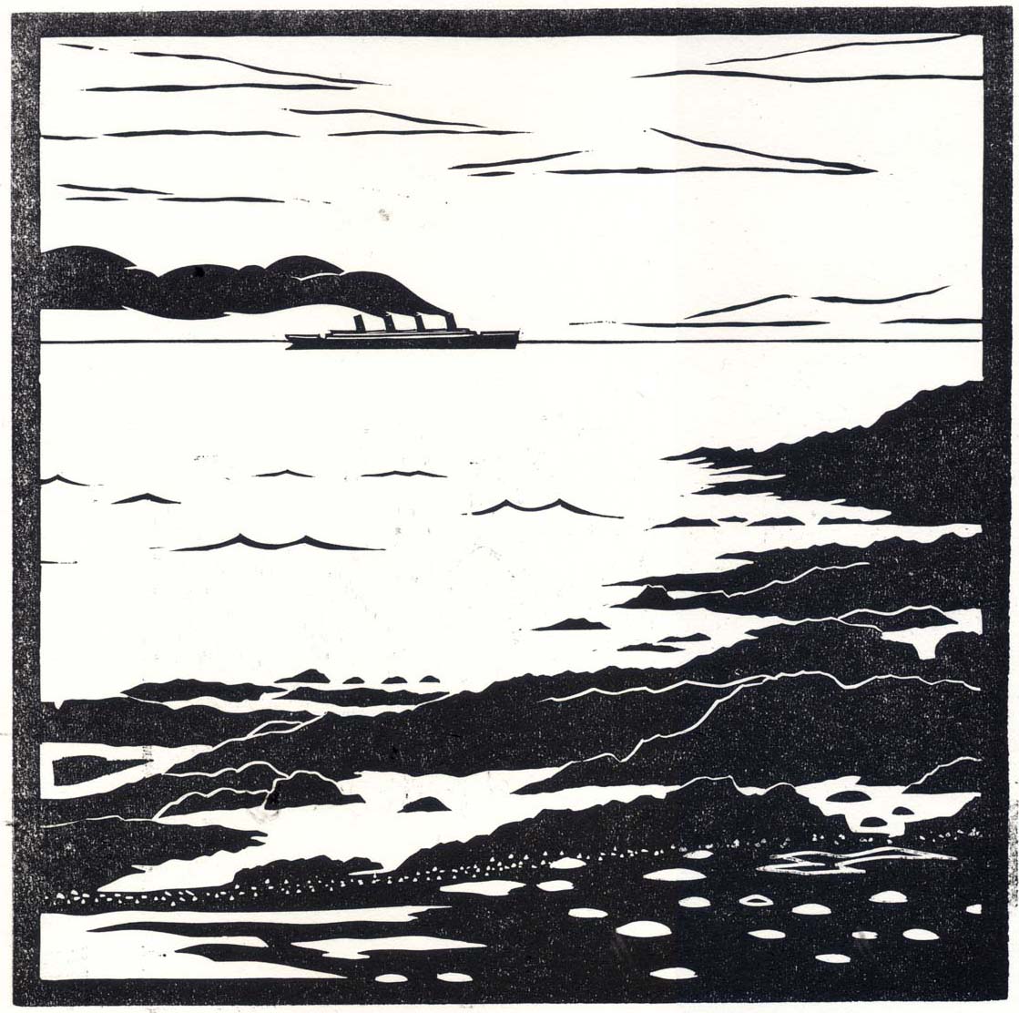
Letterpress printed at Distillers Press, NCAD, Dublin, Ireland. The book runs to 176 pages with 40 linocut illustrations and is hand bound in a limited edition of 36 copies.

Albert, Ernest & the Titanic will be launched on June 8th 2012, priced at €950. Ten copies are available to purchase pre-launch at a special price of €850. These copies are accompanied by a signed and very limited edition print of one of the book’s illustrations. The discounted rate ends when these ten are sold or on June 8th, whichever comes first.


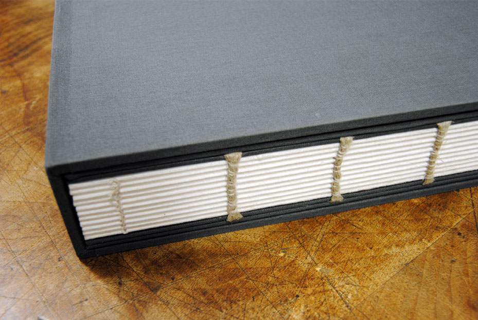
Images: Mock up of binding, Colm Tóibín's foreword, foreword coming off the press, foreword as hand set.


Production Details.
Foreword: Colm Tóibín
Illustrations: 40 linocuts 230 x 230mm.
Type: Hand set in newly cast Garamond (Hand & Eye, London), Grotesque light and Grot no. 8 (Stephenson & Blake, early 20th century)
Paper: Zerkall 225gsm mouldmade, deckled edge kept throughout.
Inks: Rubber based black, blue and 'Titanic Coal Ink' (made from coal recovered from the reck site).
Binding: Exposed glueless bind, hand bound in hard case, blind embossed with tipped in title. Binding by Tom Duffy.
Presses: Printed on a 1960's ADWEST double crown proofing press and a 19th century treadle platen.
Measurements: 15 inches x 13 inches x 2.5 inches approx.
Edition: 36 copies in total. 6 for private distribution, 30 for sale. All copies editioned and signed.


For further information please contact me.
+353 87 9626365 or jamie@fjord.ie

23 Feb 2012

TITANIC TYPE

As mentioned in a previous post I've been experimenting with a quirky typeface over the last few months. The face first appeared in the 1870's and was digitally redrawn in recent years. The face caught my attention because it appeared on an advert for the Titanic in 1912. More on the history of the face is in that previous post. The complete latest version of the face has been laser cut in 4mm birch ply. It has been illustrated with an abstract horizon which is similar in feel to carnival and circus poster types of the 19th Century. It measures 216 points high / or 18 lines / or 3 inches. Another reason for getting the type made at this stage is that I've been asked to show at an upcoming exhibition called 'Crafting Type' and I intend to show this typeface as a traditional printing form created using contemporary techniques. From the press release: "Dublin’s Grand Canal Dock is soon to be hit with Ireland’s only established creative festival, ‘OFFSET 2012’. To celebrate this bringing together of all things graphic and cutting edge, an exhibition curated by Orlaith Ross entitled ‘Crafting Type’, will cross the craft and design divide by exploring the creations of Ireland’s finest visual elite." This exhibition runs in conjunction with OFFSET, a weekend I've been looking forward to since the last OFFSET two years ago!


13 Feb 2012

COAL INK

An hours grinding with a heavy pestle and mortar produced a very fine dust out of a piece of coal, approximately the size of the piece I have which was salvaged from the Titanic wreck site. This dust was then mixed in varying amounts to a transparent base (Pantone Transparent White) before printing. The results were interesting and when the prints dried the ink was stable - it didn't wipe away under normal conditions. With the next experiment I hope to be able to achieve consistentcy so that I can print all the title pages of the book with very little variation in colour. The type I experimented with here is the typeface that will be used for the title page - S&B Gtot no.8.


10 Feb 2012

ILLUSTRATIONS (post 2)

Further to yesterday's post, here are some more proofed illustrations. They are a mix between both narratives and not in any particular order. The printers were aged 27 and 52. Myself and my father have acted as models for many of the printer's illustrations.


9 Feb 2012

ILLUSTRATIONS

Although originally intended to be an information graphics project in the back of my mind, it has slowly manifested itself into quite an illustration heavy one. The illustrations form the main body of work and carry both narratives through the book. When deciding on how the book would read, what length was comfortable and how it was to be constructed I decided to create 40 illustrations. These illustrations are divided equally between the 'Printer's narrative' and the 'Titanic's narrative' ie. 20 each. Some illustrations work together with the type elements, some are independent, but as a whole they bring the book together and create a linear progression through out. They act as story tellers in their own right. 


They are heavily influenced by photographs of the ship and by photography of the period. All the illustrations are black and white. They assume vantage points, sometimes detailed, very close to the action from the point of view of a character and sometimes more removed, quieter, taking in the landscape. As linocuts, they are carved quite graphic in style with clean lines and interesting compositions. Linoleum was specifically chosen as the means of producing the illustrations due to the time period concerned. From Wikipedia "Although linoleum as a floor covering dates to the 1860s, the linocut printing technique was used first by the artists of Die Brücke in Germany between 1905-13 where it had been similarly used for wallpaper printing. They initially described their prints as woodcuts however, which sounded more respectable."


Over time I decided to create the illustrations square instead of portrait or landscape. The book was calling out to be illustrated landscape but I felt that the square offered a more interesting perspective, the book already being landscape in format. Each illustration is contained by a frame of approx. 6mm. This was an addition which I made after several weeks planning the thumbnails. The images that follow are four proof prints, 15 have been completed to date. I'll try get more up tomorrow. Each one takes between 10 and 20 hours to complete so progress has been quite slow. They measure 230mm x 230mm.


8 Feb 2012

ONE TITANIC YEAR LATER (post 5)

Ink.
One of the areas that I found interesting was the availability of only two inks to the printers. I've noticed the majority of their work required only black but some menus seem to also include a dark blue. Taking this information I decided to also limit the colours in the book to black and blue. The illustrations will be black linoleum prints and the type will also be black. Decoration within the type elements will be blue, as will the illustrated coordinates which tie everything together throughout the book. Blue may also appear in the binding chord and possibly on the cover as a foil or a tipped in illustration but these elements have not been finalised yet.


There will also be a special ink used in the book. This ink will be made from coal salvaged from the wreckage on the Atlantic sea floor. It was salvaged by the 1994 Research and Discovery Expedition. Experiments are ongoing as to how best create this ink but it's looking like a very heavy stone mortal and pestle and a lot of elbow grease can grind it down to a fine powder. This powder could then be added to one of a number of bases - black, blue, transparent white etc. The inclusion of this ink adds another dimension to the book. There will be a part of the disaster included and linked directly to the printers as it will be applied by the very means that they themselves were used to, letterpress printing.


ONE TITANIC YEAR LATER (post 4)

One important decision to be made when designing any book is far too often an overlooked one, the paper stock. The paper plays a vital part in how a book feels and looks. Certain stocks take ink very well while others are more resistant. For this book I went down the road of mould made papers. These tend to be heavy, soft and usually have what's known as a deckled edge. This edge is achieved naturally in the mould and no two sheets are exactly alike because of it. I was struck with the simple fact that when stacked and viewed along their edge there is the illusion of waves at sea. After debating several I decided to go with a rough Zerkall 225gsm which is white in colour.


The book will be housed in a solid, heavy case which is very protective. The case is built around 5.8mm thick board and covered in a charcoal grey book cloth. Although not to actual size the mock up of this case is very impressive, special thanks again to Tom Duffy of Duffy Bookbinders (mentioned in the last post). The exposed binding has drawn attention. The idea is that it is symbolic of the many layers to Titanic, it's many decks and also serves to depict the nautical nature of the subject through the exposed binding chord, reminiscent of ropes. The chord's aesthetic is not finalised yet but may eventually be dyed blue and finished in sea knots. I like the juxtaposition of the meticulously printed and finished book and the rough, exposed binding. The next step in the journey of the binding is to experiment with different finishing techniques for the cover - hot foiling, debossing etc.


7 Feb 2012

ONE TITANIC YEAR LATER (post 3)

Concept and Construction.
Until now the printers legacy has lain hidden behind that of the Titanic. This book aims to bring the printers to the fore. This is to be realised through the book's unusual construction. Through several drafts the idea was to use the idea of the hidden, achieved by portraying the Titanic's narrative on the inside of a series of 20 french folded pages, with the printer's story portrayed on the outside. This would make the Titanic's story difficult to gain access too, one would have to peer inside the folds possibly cutting at the pages to open them up.


After a visit to the Fine Press Book Association's Oxford Book Fair I returned with a very different idea for the construction. I was uneasy with the idea that a book that took two years of work to complete might be torn or damaged in order to gain access to it's information. At the fair I came across Chicago based Bob McCamant and his Sherwin Beach Press. He talked me through a few of the bindings produced by Trisha Hammer at Collaboration Two Studios for some of his publications. These are exquisite, unusual bindings that I took my time photographing. I arrived back in Dublin with the inspiration to develop a new binding method. I contacted Tom Duffy of Duffy Bookbinders who I have worked with on a previous Book and we discussed a new bind based on these images. The first of which is the most intriguing to me, the sections are hand bound and attached to the case by the last leaf, held in a pocket.


Together we decided to leave an exposed bind as it hints at the various levels of the ship and allows us to show the binding chord, hinting at sea faring ropes etc. The hand bound book will be placed into a case and held there by the last leaf in a pocket in the inside back cover. In the front inside cover will be housed a map of the route. The first mock up is shown below.